2012 Design Trends: The Good, the Bad and the Ugly
So there’s been a lot of different trends appearing in web design this year – and a fair few that have continued on and been improved (in most cases!) from previous years.
Ribbons, cartoon characters and lots (and lots) of rounded corners and shadows have been in play this year and social media icons (and twitter/facebook feeds) have become a staple of pretty much every website.
The Good
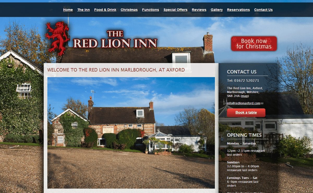
Magazine style use of photography, in the case of websites full page photography as a background, or full width photography as part of the main content of the site can have a striking effect and give an instant impression of what you’re business is all about:
The Bad
When over-used any design element can become tedious and detract from the message your website is trying to convey.
Lightbox madness
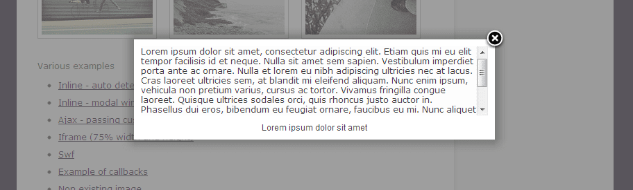
My personal bugbear from the past year has been the overuse of lightboxes and pop-up pages on sites.
Give your content the respect it deserves, leave lightboxes for photography, video and “bonus” content – don’t put your about us page in a lightbox just for the sake of it (or even worse, don’t use lightboxes to display pages just because you’ve run out of room on your navigation menus!)
Keep your content structured and leave those lightboxes in 2012 where they belong!
The Ugly
Fussy, single page websites
You know what I mean, those sites where someone has tried to cram multiple pages into one. People like structure and sticking to a page per topic is not only good for visitors but it’s good for your search engine positioning as well.
Please, please stop making your visitors scroll through paragraphs of unrelated content and images before they can find out what it is your business can actually for for them!
Touch navigation overload

Touch navigation should be restricted to tablets and smartphones – there’s nothing more annoying than visiting a website and brushing the touchpad on your laptop in just the wrong way and spiraling off to another section of the website you’re on because it’s decided you swiped left or right and want to go to the next page in the navigation structure.
Keep it simple, there’s no excuse for not at least trying to identify the device your visitor is using and tweak your navigation system accordingly.