What does your choice of colour say about your business?
Colour plays a big part in how we react to every aspect of our environment, from the space we work in to the products we buy. Taking colour into account when designing your business’ branding, product packaging, promotional materials, and even your office or retail space can have a massive effect on the impact your business has on you and your customers.
Choosing the right colour for your business or brand is crucial to it’s success and acceptance. This colour you select should appear consistently on all your promotional materials, including your logo and and product packaging. Try to choose something that isn’t already extensively used in your industry, this will allow your brand to stand out although be careful not to select a colour that doesn’t fit well with the “message” of your brand and the feelings you want to evoke in your customers.
If you have an office or retail space you might want to consider introducing the colour into your space, via feature walls of colour, brand messages, or through furnishings thereby connecting your staff to your brand throughout their working day.
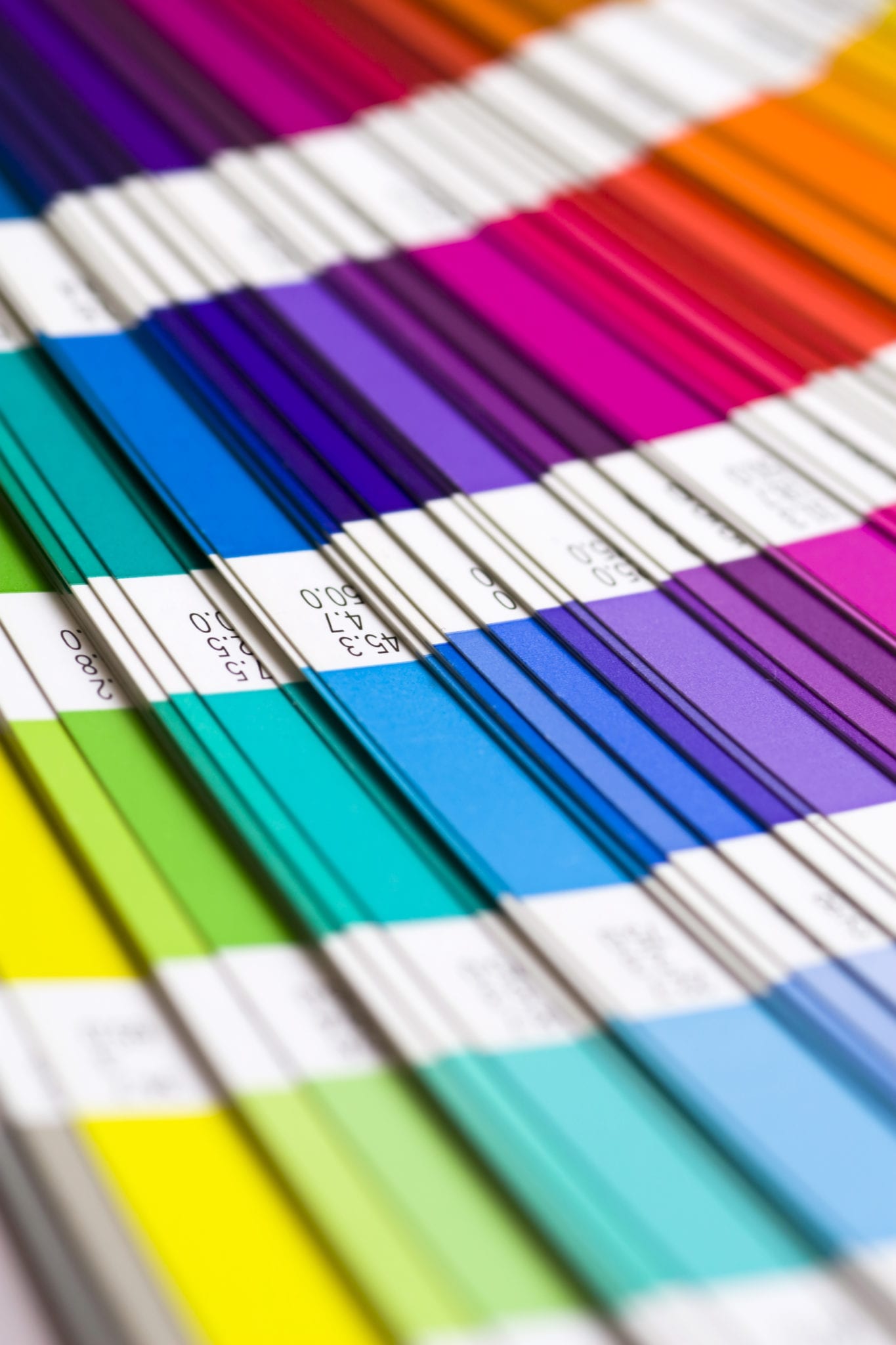
Some (brief) colour meanings
Red
Orange
https://twitter.com/BizspaceSwindon/status/491945734372331520
Orange is a warm and vibrant colour representing energy combined with fun. In colour psychology it means adventure, optimism, self-confidence and sociability.
Yellow
Pink
Psychologically pink is associated with compassion, nurturing, love, and romance. Pink is inspiring, warm and comforting, suggesting hope for the future. It is calming and non-threatening. Physiologically, pink calms and reassures our emotional energies.
Gold
Psychologically gold is seen as the colour of inner wisdom, quality and wealth. It is associated with prestige, luxury and material wealth, suggesting that a product or service is expensive and exclusive. https://twitter.com/5waysproject/statuses/492029427191406592
Green
Green is a colour of growth and vitality, associated with new life and renewal. Physiologically, green balances people’s emotions, creating a sense of calm. Green is associated with nature, health, healing, and the environment, creating a sense of compassion.
Teal & Turquoise
Psychologically, turquoise represents clarity of thought and communication. It inspires self-expression, encouraging people to tune into their own needs and calms the emotions and recharges the spirit, invigorating depleted energy levels and inspiring positive thought.
Blue
Violet and Purple
Purple suggests wealth and extravagance, fantasy and the world of dreams. Physiologically, purple heightens people’s sense of beauty and their reaction to more creative ideas and is often used to denote a high quality or superior product.
Black
Psychologically black means authority, power and control. Physiologically, black is intimidating and controlling, although its power can instill confidence in some.
Brown
Psychologically, brown is associated with strength and solidarity, comfort and earthiness, maturity and reliability. Brown relates to the acquisition of material possessions which implies security and safety, comfort, homeliness, endurance, duty, and stability.
White
White is probably the best colour to use as the background colour for websites. It allows all other colours to reflect from it and makes all colours except yellow and pastels to be very readable. White gives a sense of openness and space and is associated with clarity of thought.