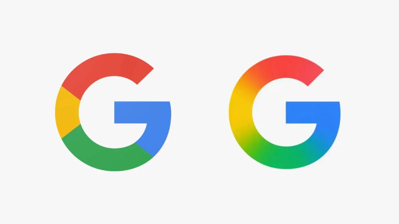
If you opened your Google app recently and thought something looked a little different, you weren’t imagining things. Google has quietly refreshed its iconic multicoloured “G” logo – the first real redesign since it was introduced in 2015. The changes are subtle, but they mark a significant shift in how the tech giant wants to be seen in 2025 and beyond.
Out with the Blocks, in with the Blend
The most noticeable tweak is the colour treatment. Where the original “G” was made up of four solid chunks of red, yellow, green, and blue, the new version features smooth gradients that melt the colours into each other. This gives the logo a more polished, modern feel. It’s not a flashy overhaul, but it’s one that reflects current design trends. Gradients are all the rage right now, bringing depth and movement to flat designs – and Google clearly wants to stay ahead of the curve.

Part of a Bigger Picture
This update isn’t just about looking pretty. It’s part of a broader visual evolution across Google’s family of products. YouTube recently updated its red play button icon to use gradients, and Google’s new Gemini AI assistant has a similarly glossy look. The aim is consistency. With so many different platforms and services under the Google brand, a unified style helps everything feel more connected and recognisable, no matter what device or app you’re using.
Small Change, Big Impact
Though the adjustment to the logo might seem minor, it’s strategic. Gradients offer a bit more visual interest than flat colours without being distracting. They allow for better scalability across high-resolution displays and dynamic environments, where lighting and background can vary wildly. And let’s be honest – the gradient “G” just looks a bit more stylish and less blocky than its predecessor.
Where You’ll Spot It First
Right now, the revamped “G” is visible on the Google app for iOS and on Pixel devices, but it hasn’t made its way to every Google service just yet. Gmail, Google Maps, and other apps are still using the older version. That’s likely to change soon as Google continues to roll out this update across its ecosystem.
Why It Matters
For most users, this kind of logo refresh will fly under the radar – and that’s exactly the point. It’s designed to feel familiar while subtly updating Google’s identity to reflect its role in a rapidly changing digital world. It’s also a nod to the evolution of branding in tech. Companies like Instagram, Microsoft, and even Apple have gradually embraced gradients and fluid design in recent years, and Google is now following suit.
So next time you tap that multicoloured “G”, take a second to appreciate the little details. Behind that gradient glow is a whole world of design thinking aimed at keeping Google fresh, friendly, and future-ready.