A new look for Google Mobile Search (May 2019)
Google’s goal with Search always has been to help people quickly and easily find the information that they’re looking for. Over the years, the amount and format of information available on the web have changed drastically—from the proliferation of images and video to the availability of 3D objects you can now view in AR.
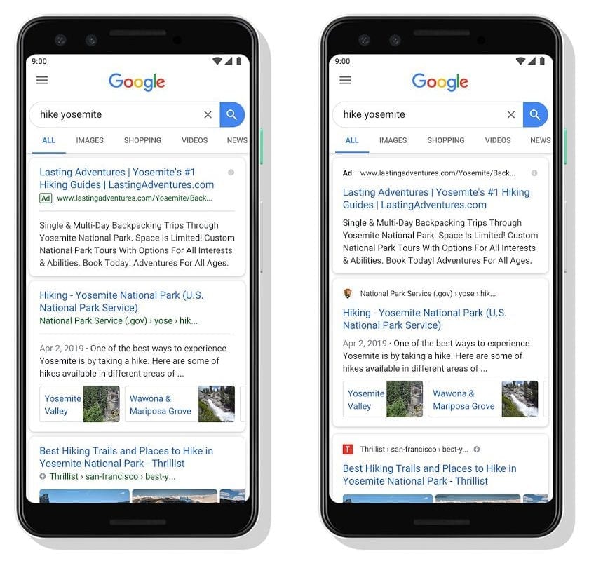
Google’s search results page has changed too over the years, to help searchers locate these new types of information and quickly determine what’s most useful. Google have continued their ongoing efforts to improve Search and provide a modern and helpful experience, and have unveiled a visual refresh of the mobile search results page to better guide searchers through the information available on the web.

With this new design from Google, a website’s branding can be front and center, helping you better understand where the information is coming from and what pages have what you’re looking for and means that things like website icons and strong branding essential for businesses wanting to be recognised in search results pages.
The name of the website and its icon appear at the top of the results card to help anchor each result, so searchers can more easily scan Google’s page of results and decide what to explore next.
According to Google this redesign is coming first to mobile and will be rolling out over towards the end of May 2019.


