Dark Patterns: Then and Now
Dark patterns have been around for as long as we can remember; they aren’t limited to websites and apps, but the term “Dark Pattern” is quite new, coined by Harry Brignull in 2010.
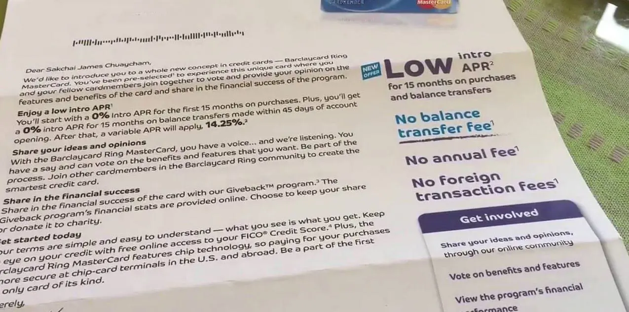
An age-old Dark Pattern example
For example, some credit card statements boast a 0% balance transfer but don’t make it clear that the percentage will shoot up to a much higher number unless the card-holder navigates a long term agreement in tiny print.

Dark Patterns are tricks used in websites and apps that make you do things that you didn’t mean to, like buying or signing up for something. This article covers some of the basics and explains why using Dark Patterns on your website is a guaranteed way to lose visitors and destroy trust in your brand.
When you use websites and apps, you don’t read every word on every page – you skim read and make assumptions. If a company wants to trick you into doing something, they can take advantage of this by making a page look like it is saying one thing when it is, in fact, saying another.
“Friend Spam”
The product asks for your email or social media permissions under the pretense it will be used for a desirable outcome (e.g. finding friends), but then spams all your contacts in a message that claims to be from you.
The most famous example of this dark pattern was used by Linkedin, which resulted in them being fined $13 million dollars as part of a class action lawsuit in 2015.
“Sneak into Basket”
You try to purchase something, but somewhere in the purchasing journey, the site sneaks an additional item into your basket, often through the use of an opt-out radio button or checkbox on a prior page.
Website hosting companies, among others, and renowned for this. Where, if not careful, purchasing a domain name can also end you up with email accounts, an Office365 subscription, unnecessary “privacy protection” – the list goes on (and on, and on)
This Dark Pattern is also known as negative option billing and inertia selling. It is now illegal in the UK and various EU countries, thanks to the Consumer Rights Directive
“Forced Continuity”
When your free trial with a service ends and your credit card silently starts getting charged without any warning – that’s forced continuity in action. You then find you are not given an easy way to cancel the automatic renewal – sometimes needing to call a totally different company to cancel.
Companies running loyalty programmes use a variety of nasty Dark Patterns in duping people out of money – sometimes this takes the form of an additional “offer” after you complete a purchase, accepting the offer (usually some kind of discount) results in you being enrolled in a loyalty programme with monthly charges – the first you know of it is when you notice amounts being deducted from your bank account or credit card!
“Bait and Switch”
The user sets out to do one thing, but a different, undesirable thing happens instead. The most famous example of digital bait and switch was Microsoft’s misguided approach to getting people to upgrade their computers to Windows 10.
During 2016, users of earlier versions of windows where shown pop-up windows similar to that pictured above.
As the year progressed, Microsoft became increasingly aggressive with the pop-ups. They started as an honest, optional call to action, but became increasingly deceptive. They switched the meaning of the “X” button at the top right to mean the opposite of what it normally means. In all other versions of Windows going back to the 1980s, this button means “close”. In this specific instance, they changed it to mean “Yes, I do want to upgrade my computer to Windows 10”.
This caused a huge public backlash.
Want to know more?
After coining the term, Harry Brignull registered a website called darkpatterns.org,
“a pattern library with the specific goal of naming and shaming deceptive user interfaces.”
He also explained how these patterns work by giving us an example,
“When you use the web, you don’t read every word on every page — you skim read and make assumptions. If a company wants to trick you into doing something, they can take advantage of it by making a page look like it is saying one thing when in fact it is saying another. You can defend yourself against dark patterns on this site.”
Brignull further listed 11 types of dark patterns on his website –
- Bait and Switch
- Disguised Ads
- Forced Continuity
- Friend Spam
- Hidden Costs
- Misdirection
- Price Comparison Prevention
- Privacy Zuckering
- Roach Motel
- Sneak into Basket
- Trick Questions