What is responsive website design (and why your website should be responsive)
Responsive website design is an approach to designing websites that focuses on creating sites that provide an optimal browsing experience – viewing content and navigating the website with minimal panning, scrolling and resizing – across a wide range of devices (from mobile phones and tablets to desktop computers and laptops).
Responsive v Mobile website design
While mobile design advocates creating a unique website for your mobile visitors, responsive design is all about re-purposing your existing website to accommodate different screen and device types.
When thought of in those terms the advantage of responsive design is clear, no need to keep two websites up to date and by using responsive design techniques you ensure that the information your visitors see is the same, regardless of the type of device they use to access your website.
Mobile design
Mobile design has it’s place of course, if the primary purpose of your website is action related (booking a taxi for example) you might want to consider a mobile website that allows visitors to book a car as soon as they reach your site and only display certain key information about your business.
Responsive design
On the other hand, responsive design is more suitable if your website is evolving – for example, if you have a blog or gallery or other elements on your website. In this case your responsive website will allow visitors to access this information quickly and easily regardless of the device they are using.
We went responsive and never looked back…
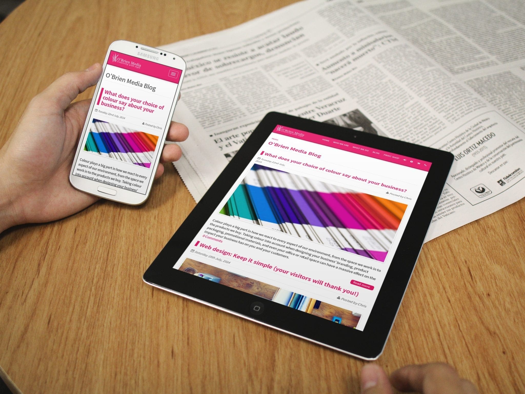
We use responsive techniques on our own website (since our redesigned site went live at the end of July), put simply, we use a combination of design techniques and server side processing and device detection to work out the type of device (mainly screen size) that the visitor is using to access our site and then cut down the information presented on the page to make the process of accessing the information they want on our website as simple as possible.
As an example, if you access our website on a desktop or laptop computer you’ll see the full site, with a deep header area, full size logo, and a content area with a sidebar (on some pages) whereas if you access it on your phone the sidebar is replaced with navigation dropdown menus, the logo shrinks (as does the header area) and the main menu shrinks down to a mobile friendly version – the main purpose of all of these changes is to make browsing the site easy on a smaller screen and to make the content of the page the focus of the browsing experience.
Next steps
The great thing about responsive design is that it can easily be added to an existing website with minimal fuss and is probably one of the most cost effective changes you could make to your website. Having a responsive website has the prospect of boosting sales by making your site more appealing and usable for visitors using their mobile phones.
Ask us about going responsive today [icon:fontawesome:chevron-right]